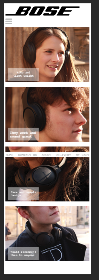
 This image is of my Mobile design.
  This is what happens when you click the menu button at the top. A box will aper I have done this because I want to it be simple to use and I don't want there to be lots of things on the front page.
 This is what my home page looks like for the computer. I have put a slide show, showing four images. I have done this because its bigger so I am able to show each image at one time.
Your website looks good Ben, although this blog post doesn't cover all the topics I asked you to talk about (Write about your design choices: the photos you took and chose, the navigation, the footer, the CTA) The images you shot look great, they show off the product well and look professional. I think your desktop design is good, although the links may be a bit large and distract the viewer from the centre. Is the centre image only a slideshow or do the images click through to a product? Would be nice to still have a CTA button (show now) to make it clear how to view the product. The branding is simple and appropriate. Your mobile menu might work better if the links were stacked in one list since it is hard to tap on small items sitting side by side. Overall you've done a great job, I look forward to seeing your product page.
ReplyDelete